Exploring qPCR data
All methods · June 11, 2026 · Jan Hellemans
Exploration is the open-ended part of qPCR analysis: looking at your relative quantities from several angles to see what the data is telling you. We describe how Clarida keeps this exploratory mode deliberately separate from formal statistical testing, why that separation protects against p-hacking, and how any view worth keeping can be frozen into an annotated, citable snapshot for reporting.
Once a qPCR run has been processed into relative quantities and checked for quality, the interesting work begins: figuring out what the numbers actually say. Is the target up or down in the treated group? Do two genes move together across samples? Does expression track a dose, an age, or some other measured property? This is exploration: open-ended looking, before any formal claim is made.
Exploration sits after quality control, and the two differ in kind. QC asks fixed questions with clear expectations (is this normalization factor an outlier? did the positive control land in range?), whereas exploration is open-ended, which is why it follows QC rather than absorbing it.
Exploration is meant to be fast and interactive. You pick an assay-part, group your samples, switch the scale, reorder the bars, and the chart redraws as you go. The point is to spot patterns and problems in what you see, and from there to form a hypothesis worth testing. That same fluidity, though, is exactly what makes statistical testing, the step that follows, dangerous if the tool does not draw a line. That risk is the central design decision behind how Clarida handles analysis.
Exploration means looking from several angles
There is no single "right" exploratory view, because a qPCR dataset can be questioned in several directions. Clarida offers a few complementary ones, less as a fixed toolkit than as an indication of what exploration can look like:
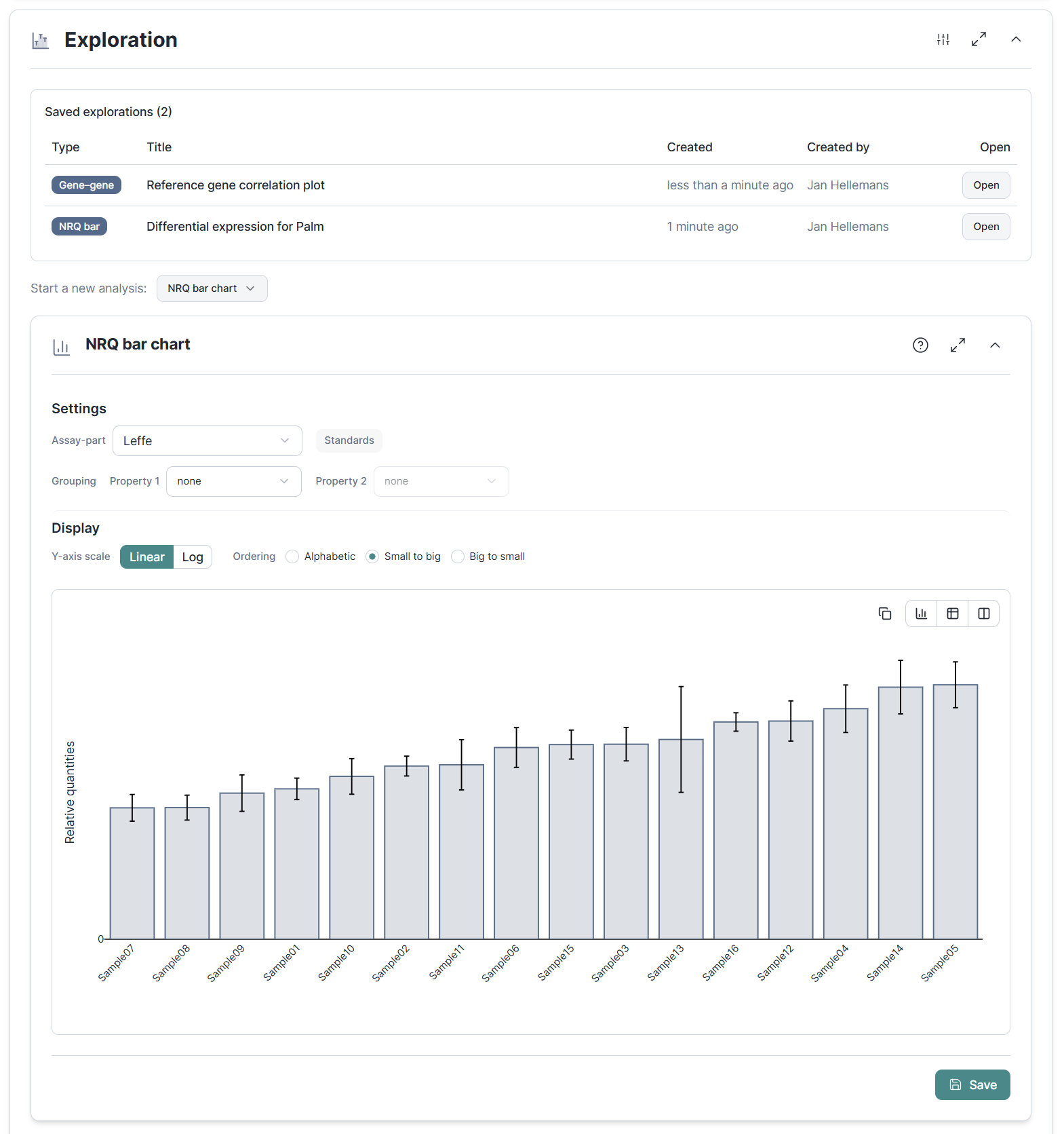
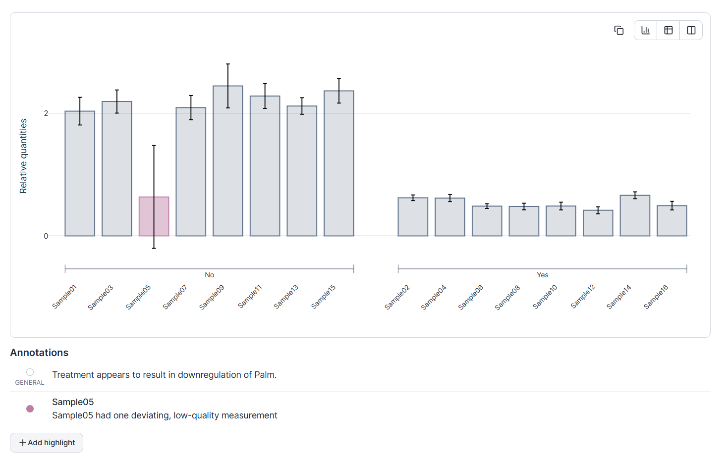
- Within one target, across samples. A bar chart of relative quantities per sample for a chosen assay-part, the most direct read on "is this gene higher in these samples than those?" Group the bars by a sample property and the comparison you care about lines up visually.
- One target against another. A gene–gene correlation plots the relative quantities of two assay-parts, one point per sample, to ask whether they co-vary. This is useful for spotting co-regulation, or for sanity-checking that a candidate reference gene really is flat relative to others.
- A target against the biology. An NRQ–sample correlation plots relative quantities against a numeric sample property such as dose, age, or optical density, to ask whether expression tracks something you measured at the bench.
These are different questions asked of the same processed numbers. The value is in having more than one angle, not in any one chart. Whichever you reach for, the view is live: every setting recomputes the picture immediately.
Why exploration is kept separate from testing
The same interactivity that makes exploration useful is what makes it easy to fool yourself. You see a trend, adjust the groups, re-run a test, and by the time a result comes out significant you have lost count of how many non-significant ones came before it. This is the everyday shape of p-hacking and HARKing (hypothesizing after the results are known), and it rarely starts with bad intentions. It starts with a workflow that lets you explore and test in the same breath.
Most analysis tools do nothing structural to prevent this: exploration and testing live in the same surface, so nothing stops you from sliding from one into the other in a single motion. Clarida makes the careful workflow the default one instead. Exploration and formal statistics are separate stages, and they behave differently on purpose:
- Exploration is live. Settings update the chart as you tweak them. This is correct for forming a hypothesis and wrong for confirming one.
- Statistics is click-to-compute. You set up a test once, run it, and the result is saved with its settings and data intact. There is no live preview that updates as you nudge a parameter; trying a different configuration means creating a new, separately recorded analysis.
That removes the two mechanisms that make p-hacking frictionless: results that move as you adjust settings, and the absence of any persistent record of what you actually ran. It will not stop someone determined to mislead, but for a researcher who wants to do rigorous work, it takes away the easy ways to drift into a result. The statistical side, meaning which tests apply when and how each is computed, is a methods topic in its own right and is covered separately.
From a fleeting view to a frozen record
An exploratory view is only useful later if you can get back to exactly what you saw. The obvious move, a screenshot, captures pixels but not provenance: change the experiment afterward and the screenshot quietly becomes a picture of data that no longer exists.
Clarida saves explorations as snapshots, not screenshots. A stored analysis captures all the underlying data and every setting at the moment of recording, so it is unaffected by anything you change in the experiment afterward. You build up a list of recorded findings (a signal worth following up, a technical artifact worth remembering), each one a stable, self-contained record. Because the data is frozen with it, a saved analysis can form the basis for a citable result.
When you want to iterate on a saved view without losing it, you make an editable copy that keeps a link back to the original. The first record stays intact; the variant is a new line of inquiry. Snapshots are also designed to be the building block for Clarida's planned reporting: a finding you freeze during analysis is ready to become part of the write-up later, with no re-creation step.
An analysis that carries its own message
A frozen chart still leaves the most important thing unsaid: what you noticed, and why it matters. So a stored analysis can be annotated, much like the legend of a figure in a paper.
You can attach a note to the analysis as a whole, stating the message you want it to carry. You can single out individual datapoints, marking them with colour or an alternative symbol, and give each its own note, so an outlier or a standout sample comes with its explanation attached rather than living in your memory. The result is a chart that travels with its own commentary: not just what the data showed, but what you concluded and which points led you there.
This is where exploration pays off. The loop runs from open-ended looking, to a frozen record, to a record that says something, turning a passing observation at the screen into a durable, communicable piece of evidence, without ever blurring the line between exploring the data and testing a claim about it.