
The qPCR platform from the team behind MIQE, geNorm & qbase+
From Cq values to defensible results.
We guide you through the whole analysis, so nothing important slips past you.
The analysis workflow
Six steps from your instrument export to a result you can cite. Tap any step to see it in detail.
- 1Import & annotate
Drop the export your instrument already made — only a well and a Cq column are required.
Most exports read unmodified; every step reversible. - 2Cq processing
Turn raw Cq values into normalized quantities — the core of a defensible result.
- 3Sample & Assay QC
Every quality metric drawn as a distribution — each sample and assay a point against the pack. Outliers surfaced, never auto-removed.
- 4Exploration
Chart, correlate, and annotate live — and save it as a snapshot, not a screenshot, so the finding survives re-normalization.
- 5Statistics
The named tests most qPCR papers need — computed and locked in one step.
An effect and an interval, not a lone p-value. - 6Applications
Validated, cite-ready analyses on top of your data — reference-gene selection and plate homogeneity, each a guided tool.
The qPCR platform from the team behind MIQE, geNorm & qbase+
From Cq values to defensible results.
We guide you through the whole analysis, so nothing important slips past you.
Sample & Assay QC
Exploration
Chart, correlate, and annotate — follow the data live.Import
Statistics
Formal statistical tests, saved and locked once you run them.Turning the Cq values into a conclusion you’d defend used to be hard. Not anymore!
A trustworthy conclusion depends on a dozen checks — clean replicates, sound normalization, the right exclusions, a sanity-checked standard curve, an appropriate statistical test.
Most tools don’t walk you through them, so it’s on you to remember every one, and easy to skip a step without noticing until someone asks.
We think it shouldn’t be on you to remember all of it. So we made sure it isn’t.
Guided workflow, from Cq to conclusion
Every QC check, in the workflow
Annotate any finding, it stays with the data
A statistical result you can cite
Mapped to your design
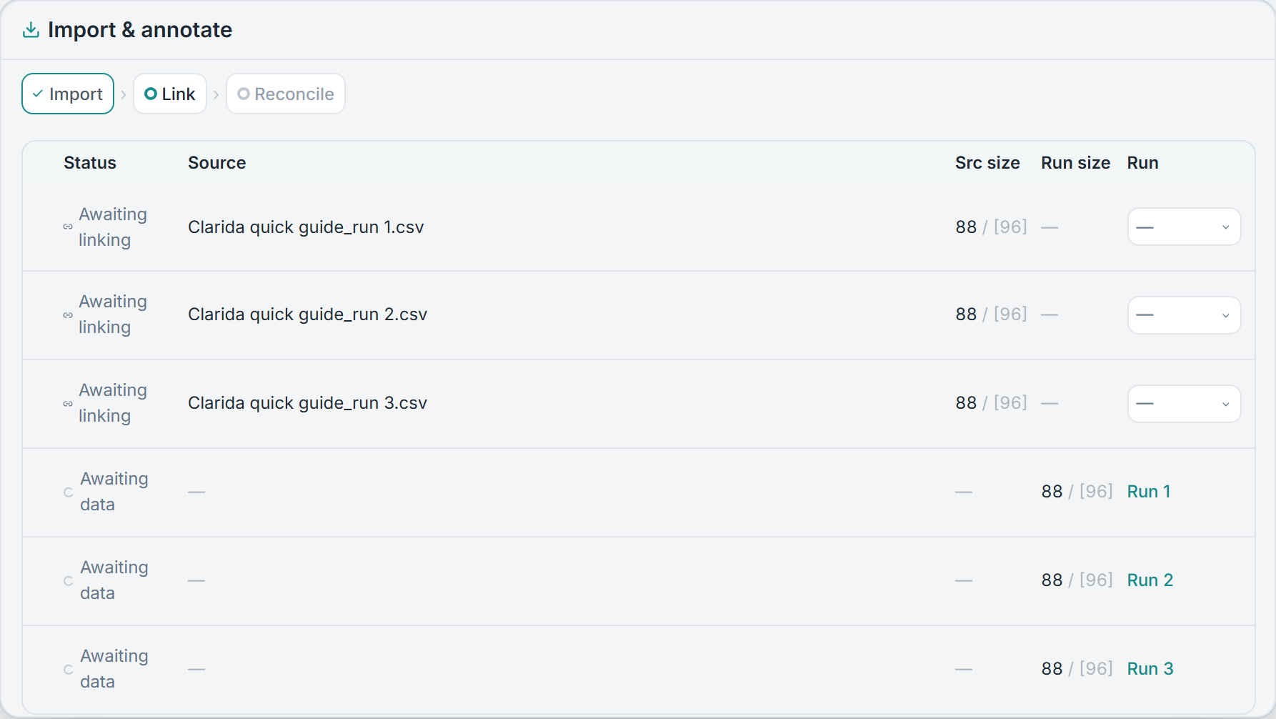
Drop the export your instrument already made — .xlsx, .csv, .txt, .tsv, or RDML, needing only a well and a Cq column. Instrument vendors share no common format, so header names are matched case-insensitively against a list of known aliases; most exports are read unmodified, and anything it can’t place is flagged for you to map by hand rather than failing the import. A workbook with several sheets is read sheet by sheet, and each source that holds Cq data is detected and parsed on its own.
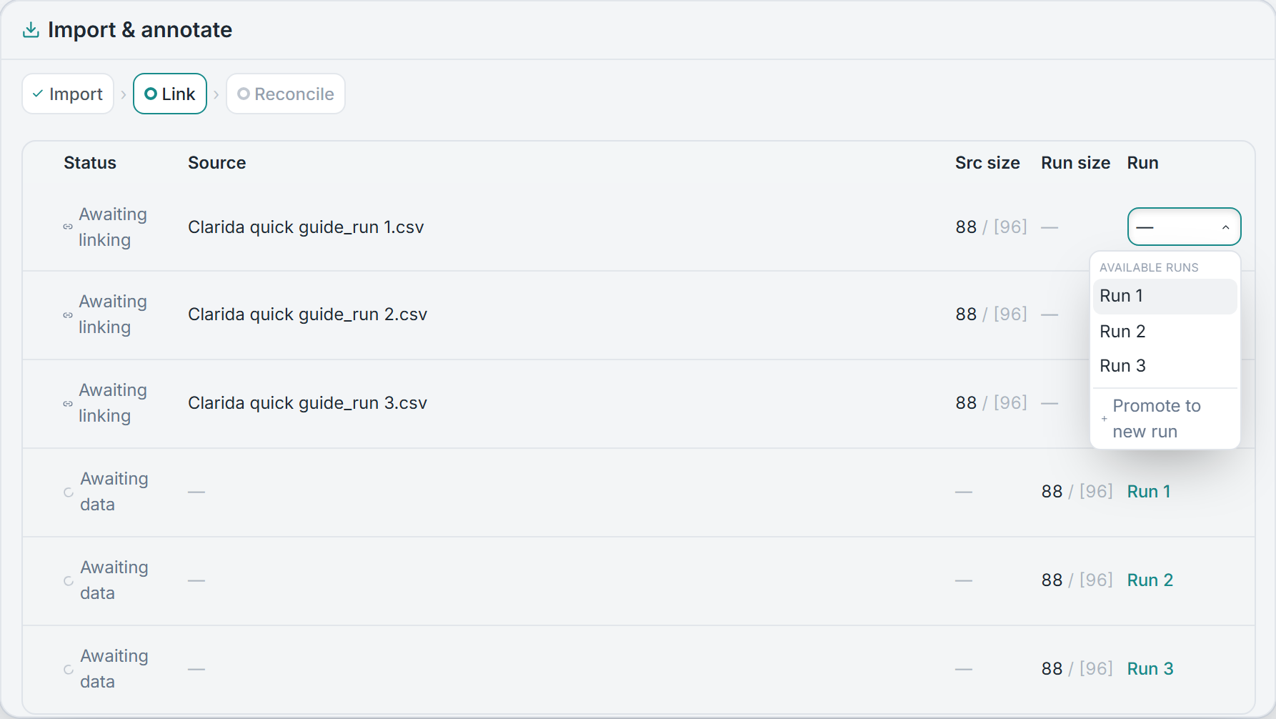
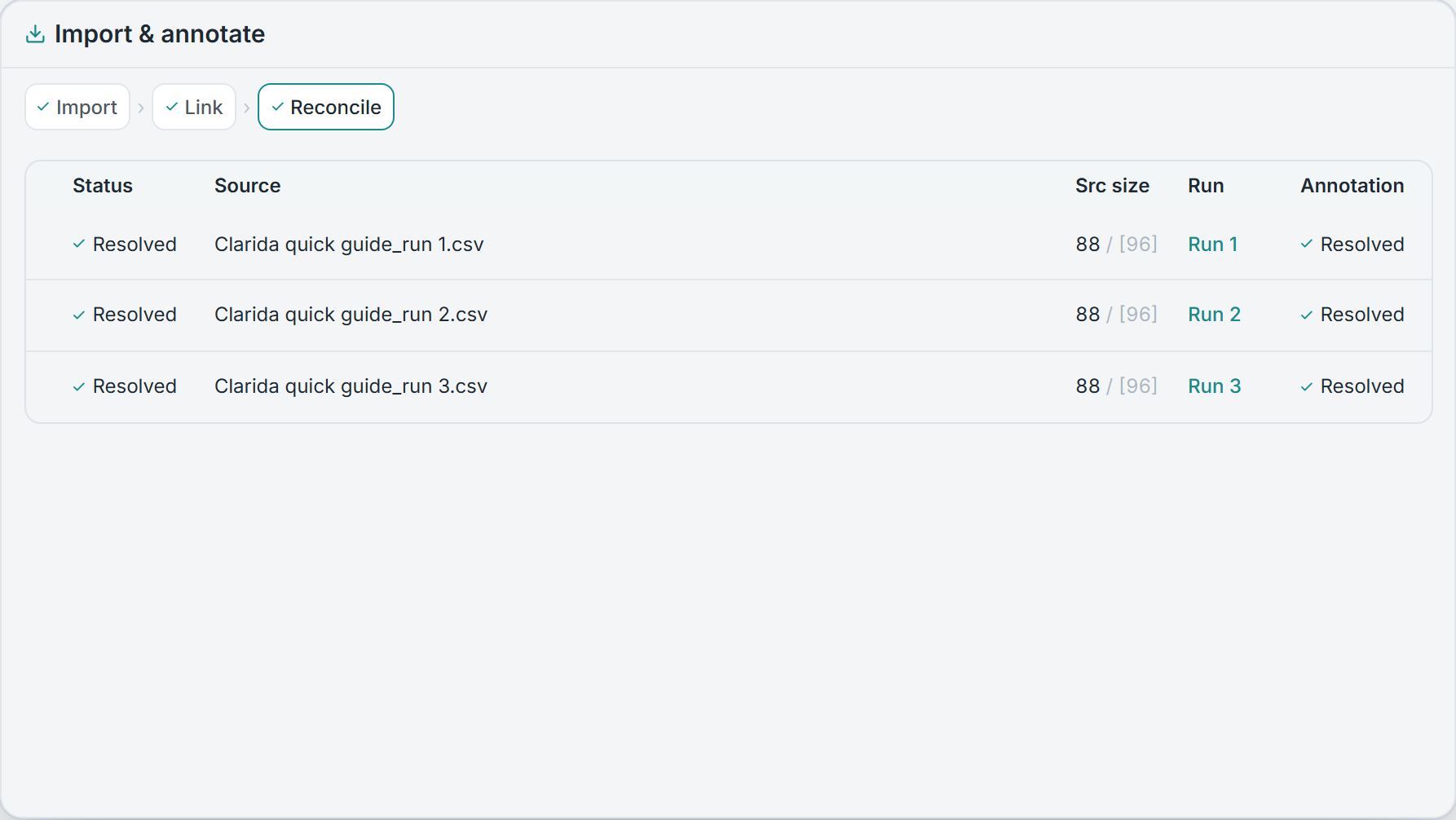
Each file is then linked to its run and reconciled against your design. Sample names that differ, a workbook of several runs, a re-run that replaces earlier data — all handled by assigning and reconciling sources, not by demanding a fixed naming scheme. Matching wells resolve on their own; only genuine conflicts ask for a decision, and committing merges rather than overwrites. With no design to protect, it collapses to a single step. Nothing happens silently, and every step is reversible.
Cq processing
Reasoned, not silent
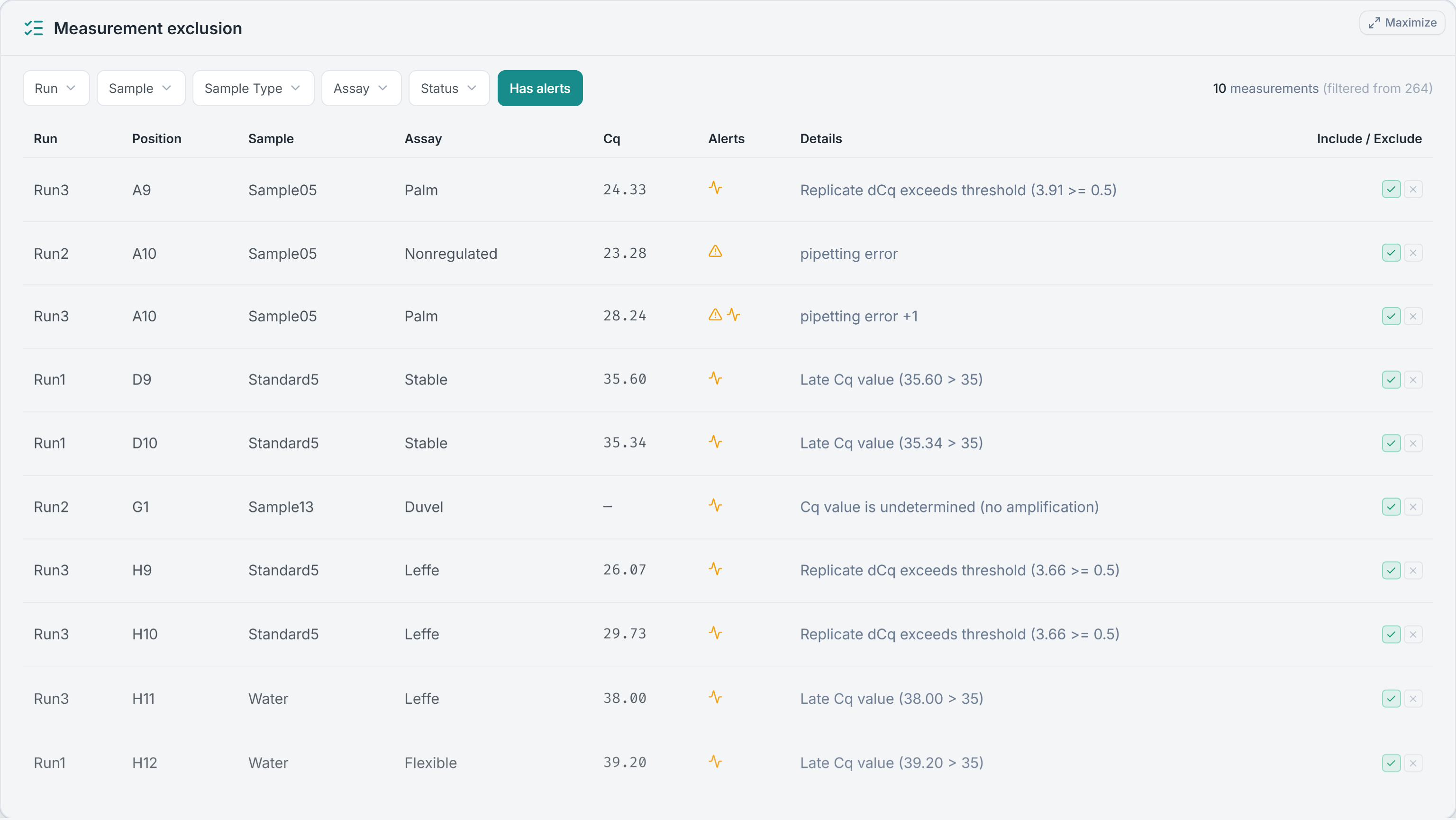
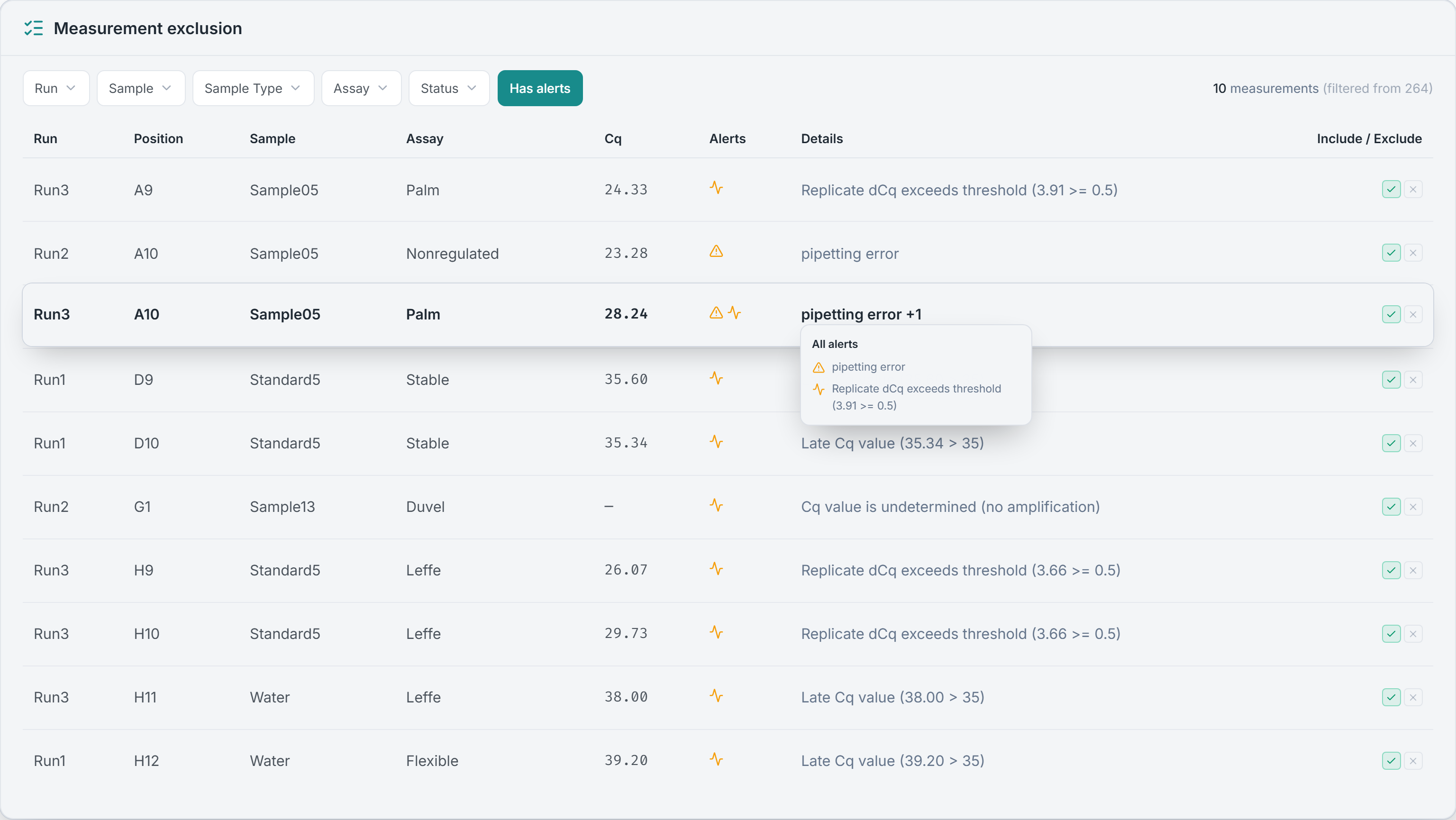
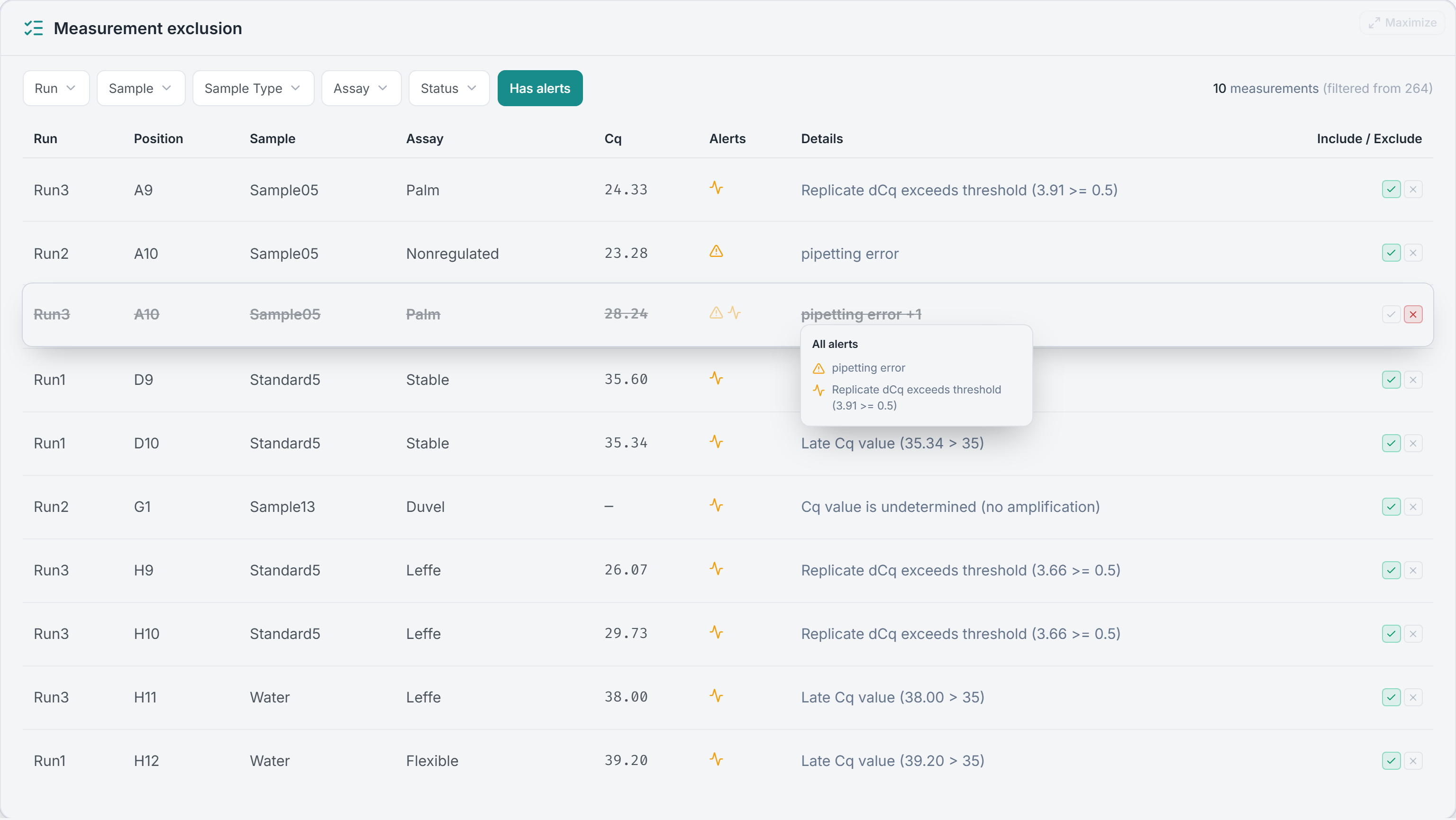
Every measurement that looks off is surfaced with a reason attached, not a bare exclusion. Some reasons are read straight from the Cq values — undetermined wells, a Cq past your late threshold, replicates that disagree beyond a threshold you set. Others are bench notes you flagged upstream, like a pipetting error, that carry through to the same row. Filter to just the flagged measurements, read why each was flagged, and decide.
Exclude by hand, or let a rule you set handle failing replicates — either way, manual and automatic decisions never overwrite each other, so nothing is quietly cherry-picked. The imported Cq values are never altered, one click re-includes anything, and every exclusion can carry a note — a documented, reversible record, not a row silently deleted in a spreadsheet.
Every outlier, surfaced
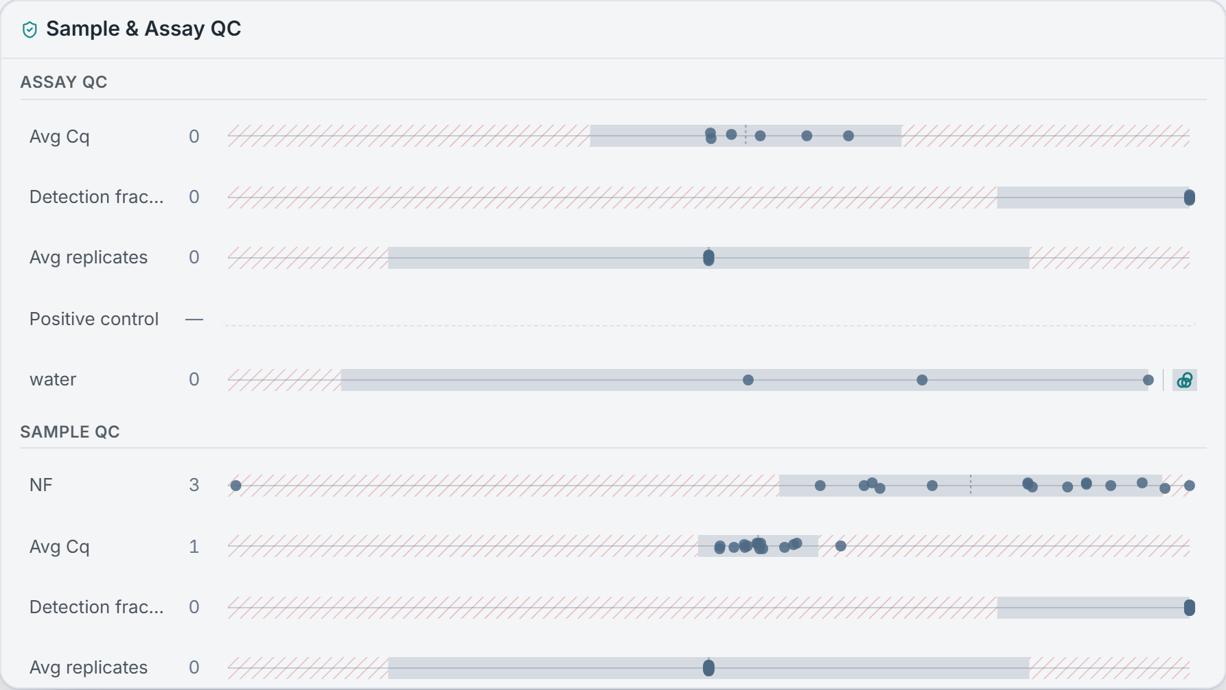
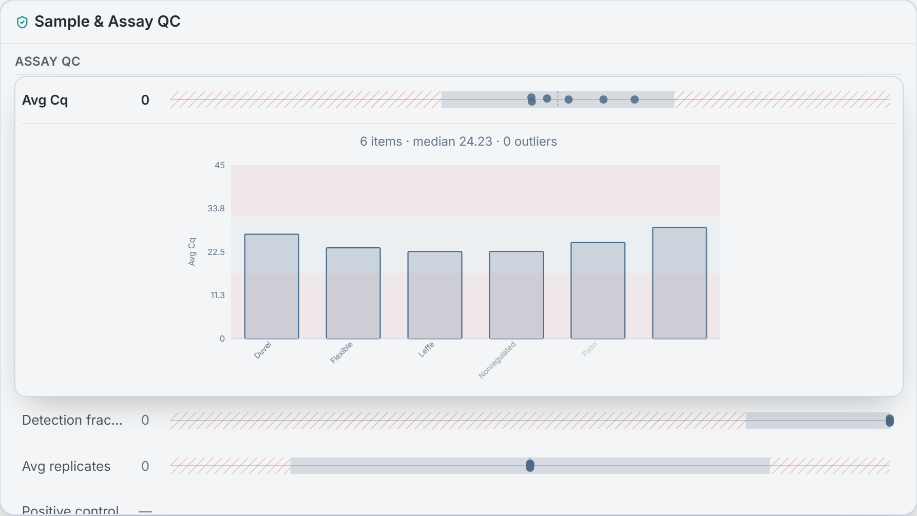
A bad sample or a contaminated assay is easy to miss until it has already skewed your result. So every quality metric — normalization factor, average Cq, detection fraction, replicate count — is drawn as a distribution, with each sample and each assay a point against the pack: a failed target is as easy to catch as a problem sample. Outliers are flagged relative to the rest, not by a single pass/fail, so you see the shape and exactly where each one sits. Positive and negative controls are checked in the same view — a contaminated no-template control has nowhere to hide.
Distribution outliers and control checks share one view, so you read a single widget instead of two. And it stays honest about small numbers: with too few samples to define a distribution, a metric shows grey rather than inventing outliers it can’t compute. Nothing is auto-removed — outliers are surfaced, you decide what to exclude upstream, and the view updates.
Follow a hunch, and keep it
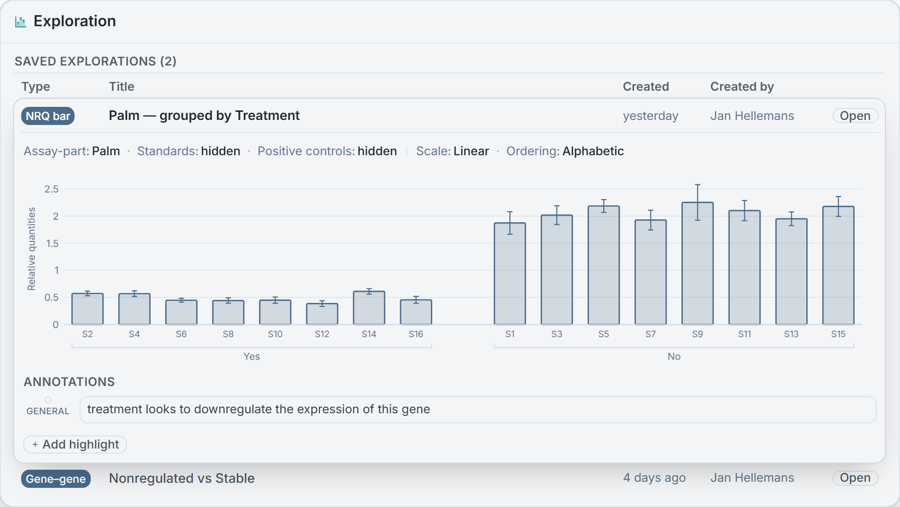
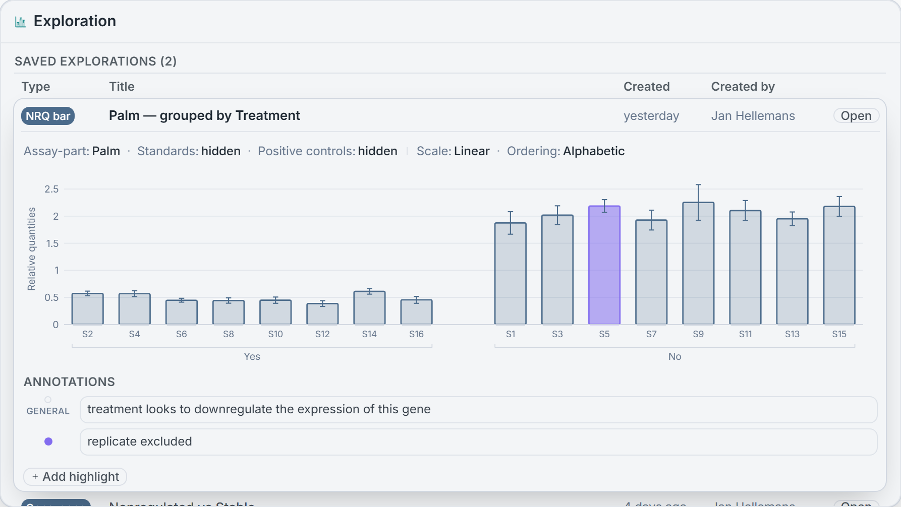
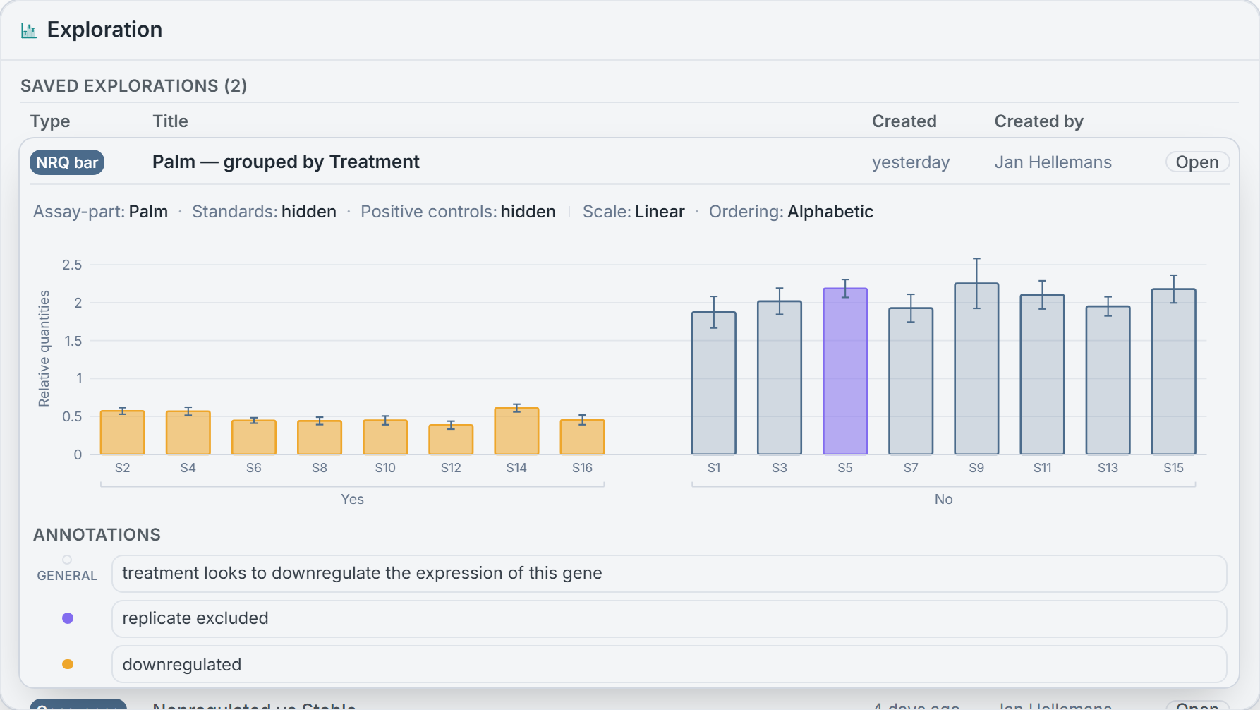
You spot something — a group that separates cleanly, a sample sitting where it shouldn’t. Weeks later you go looking for it and can’t rebuild it: the target, the grouping, the scale — all gone, and the note you jotted points nowhere. So mark the points, write the note on the figure, and save it — as a snapshot, not a screenshot: the values and display settings travel with it, and because the record is frozen, it reopens exactly as you left it — even after you re-normalize, rename a sample, or drop a grouping upstream. The finding survives, instead of the vague memory of one.
Explore live: an NRQ bar chart grouped by up to two sample properties, one gene against another, or expression against a numeric value like dose or age, each with a Pearson or Spearman fit. Testing lives in a separate Statistics step, on purpose — you look around freely here and decide formally there, so a hunch never quietly becomes a p-value. And every snapshot is built to carry into the reports we’re assembling next.
A result you can cite
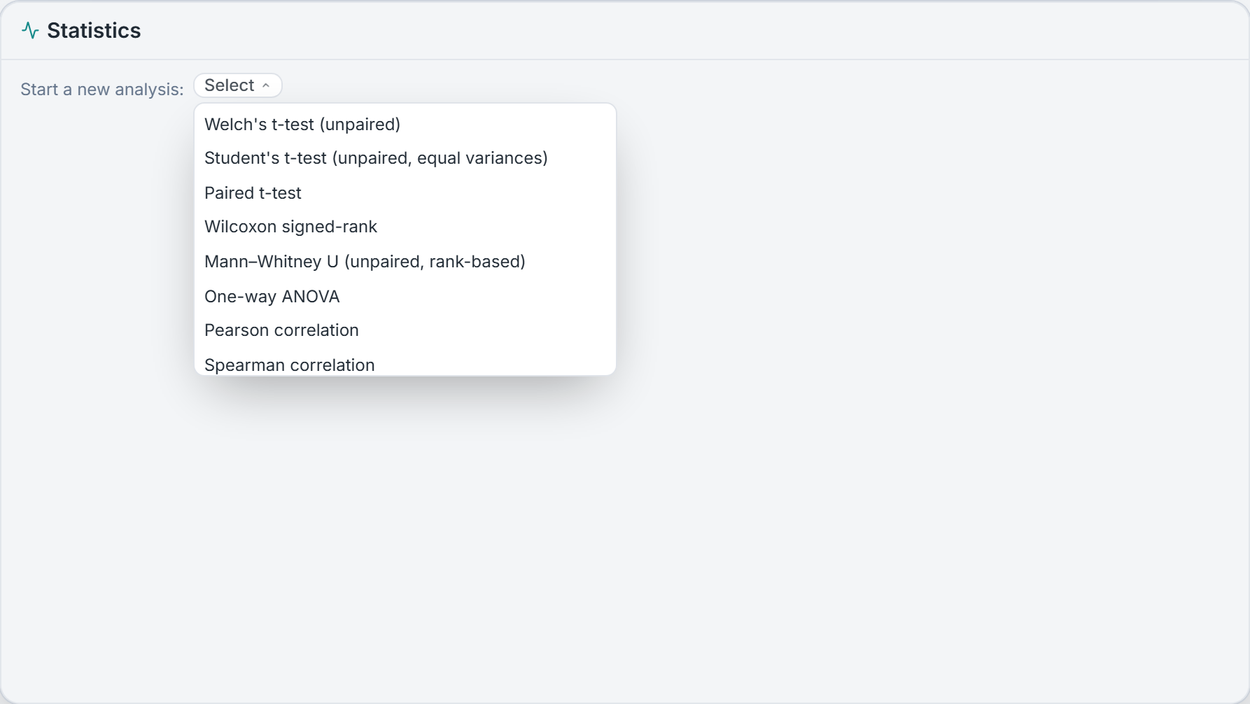
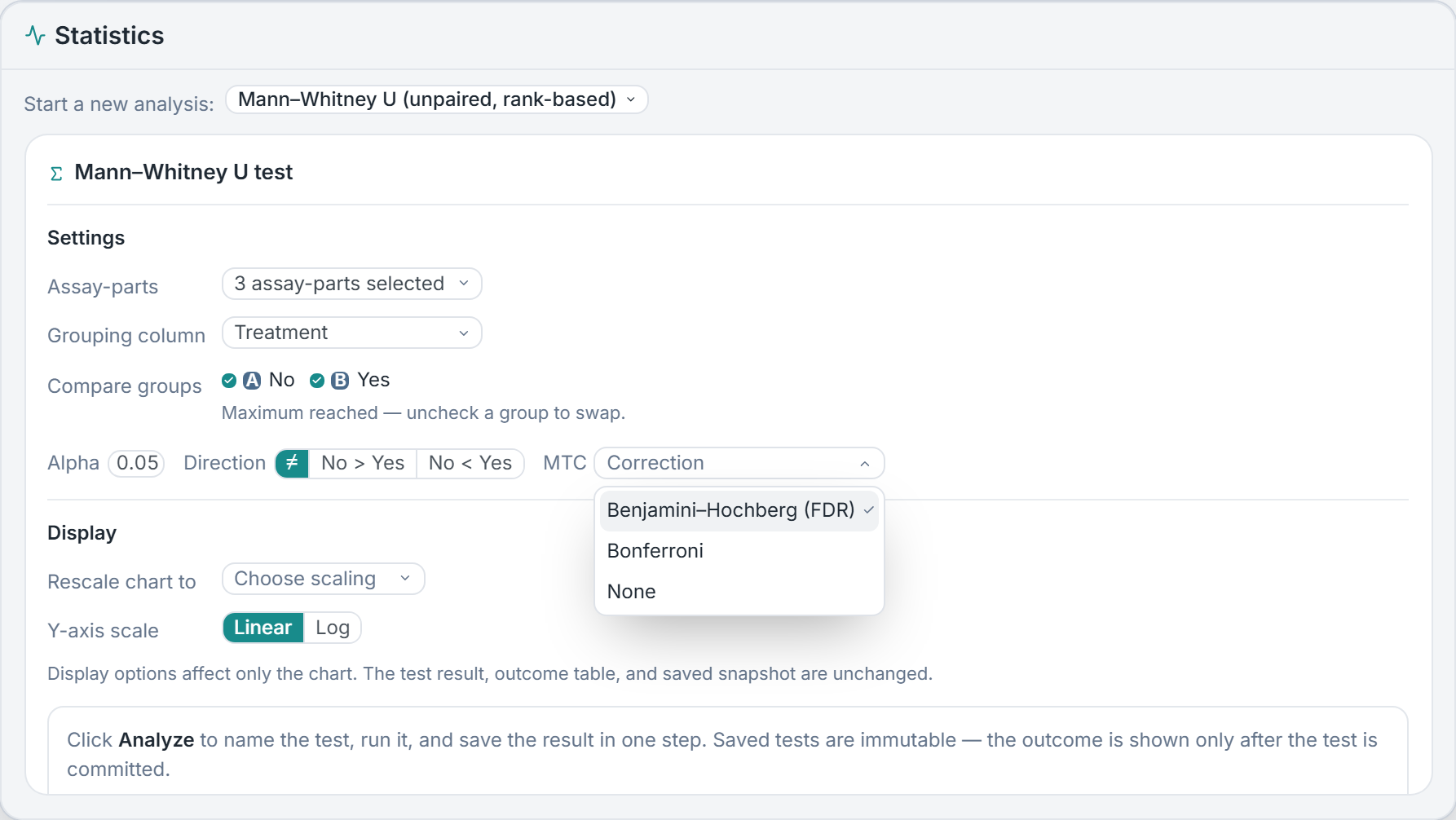
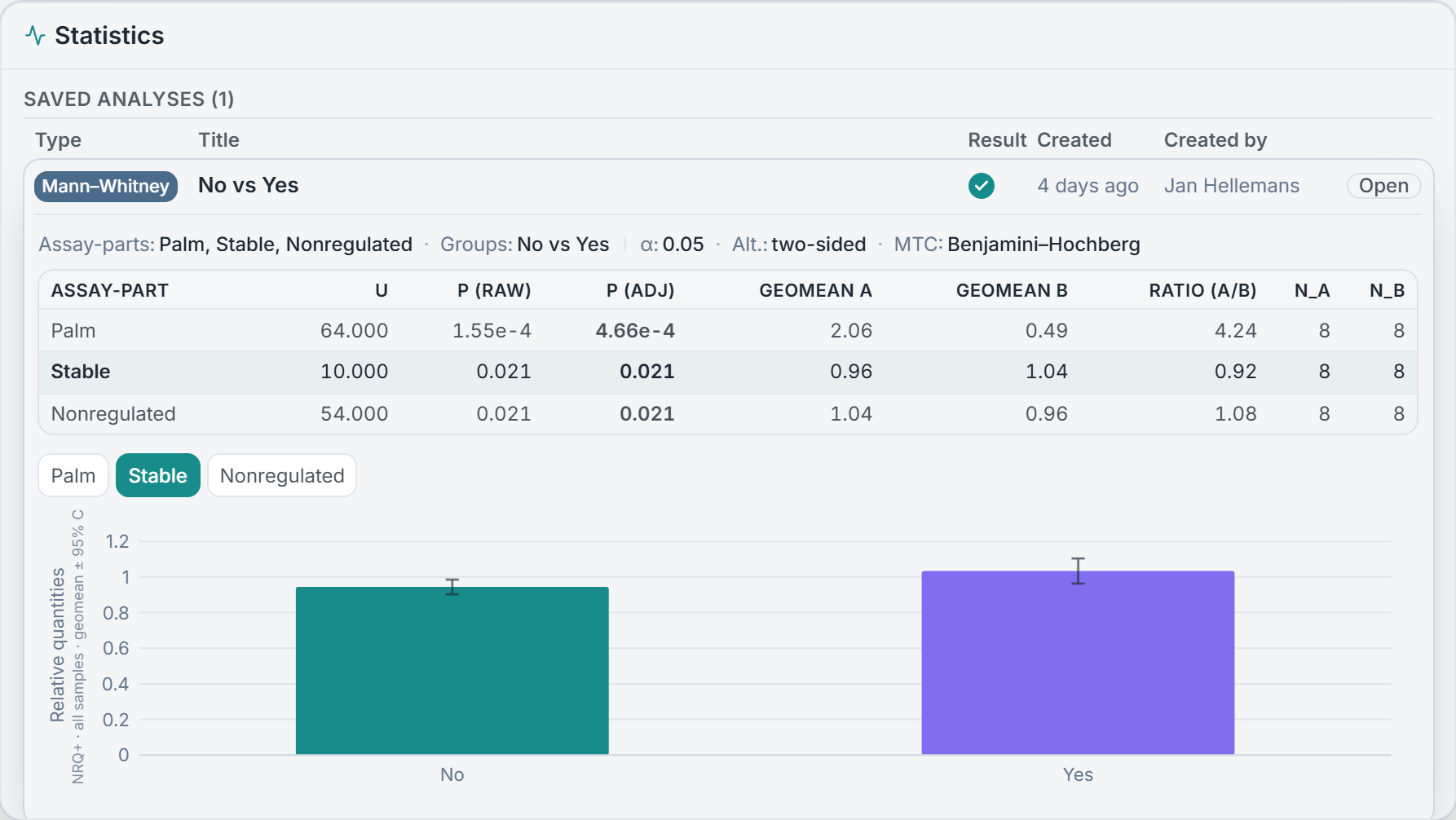
Exploration is where you look; this is where you decide. Set a test up, click Analyze, and it computes and saves in one step — with no live preview redrawing as you nudge a group or swap a gene, so a result can’t quietly drift until p falls where you wanted. To try another configuration you make an editable copy, which leaves the original untouched: each run is a frozen record of exactly what you tested, so the record of what you ran doesn’t disappear.
These are the named tests most qPCR papers need — Welch’s and Student’s t-tests, paired t-test, Wilcoxon signed-rank, Mann–Whitney U, one-way ANOVA with post-hoc comparisons, Pearson and Spearman correlation — with the parametric and non-parametric counterparts side by side for you to choose, not the tool. Group tests run on log10(NRQ) and return a geometric-mean fold-change with confidence intervals, and Benjamini–Hochberg correction is applied across the genes in a single test — an effect and an interval, not a lone p-value. What you cite is what you computed.
Applications
Pick reference genes you can defend
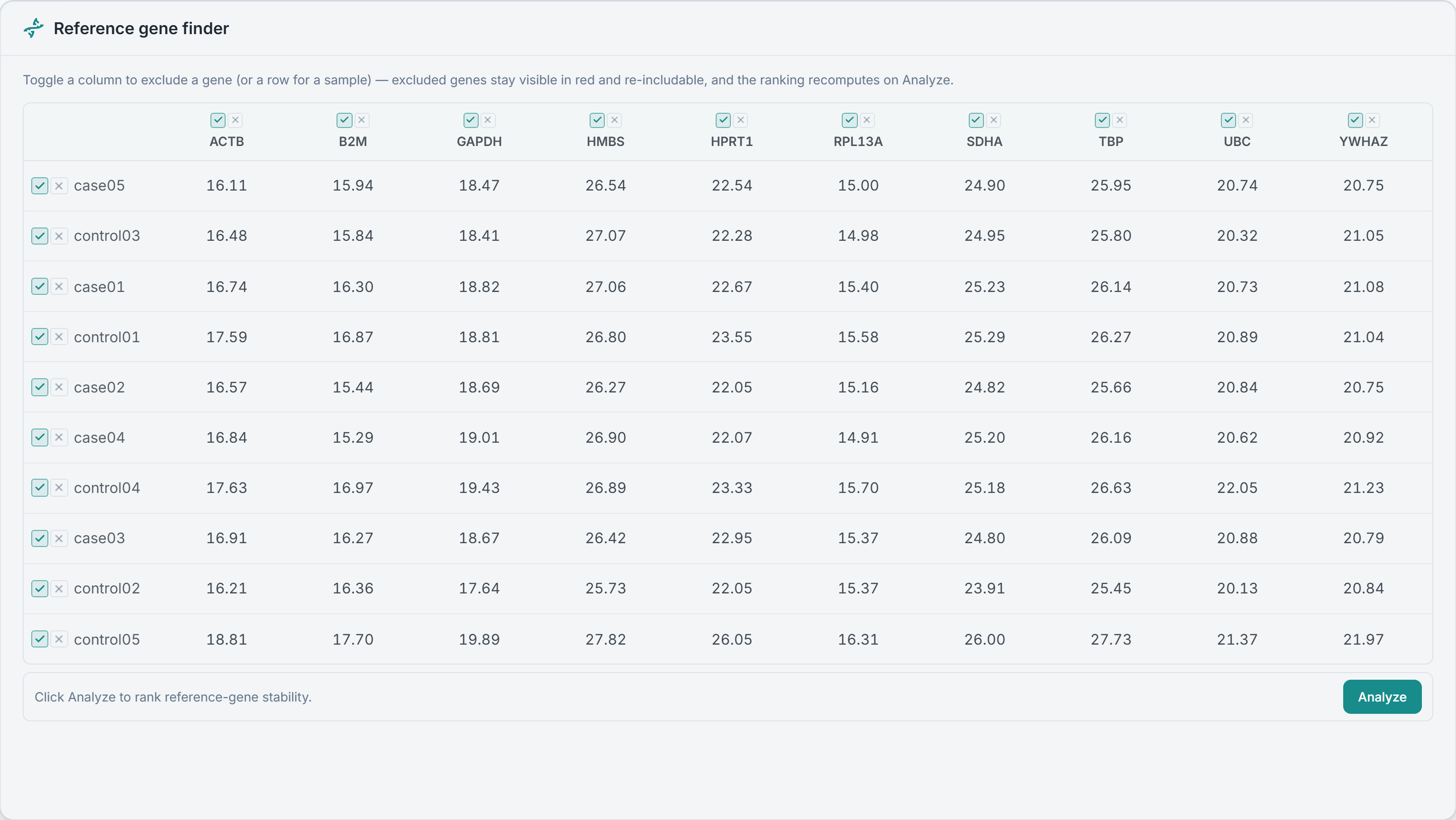
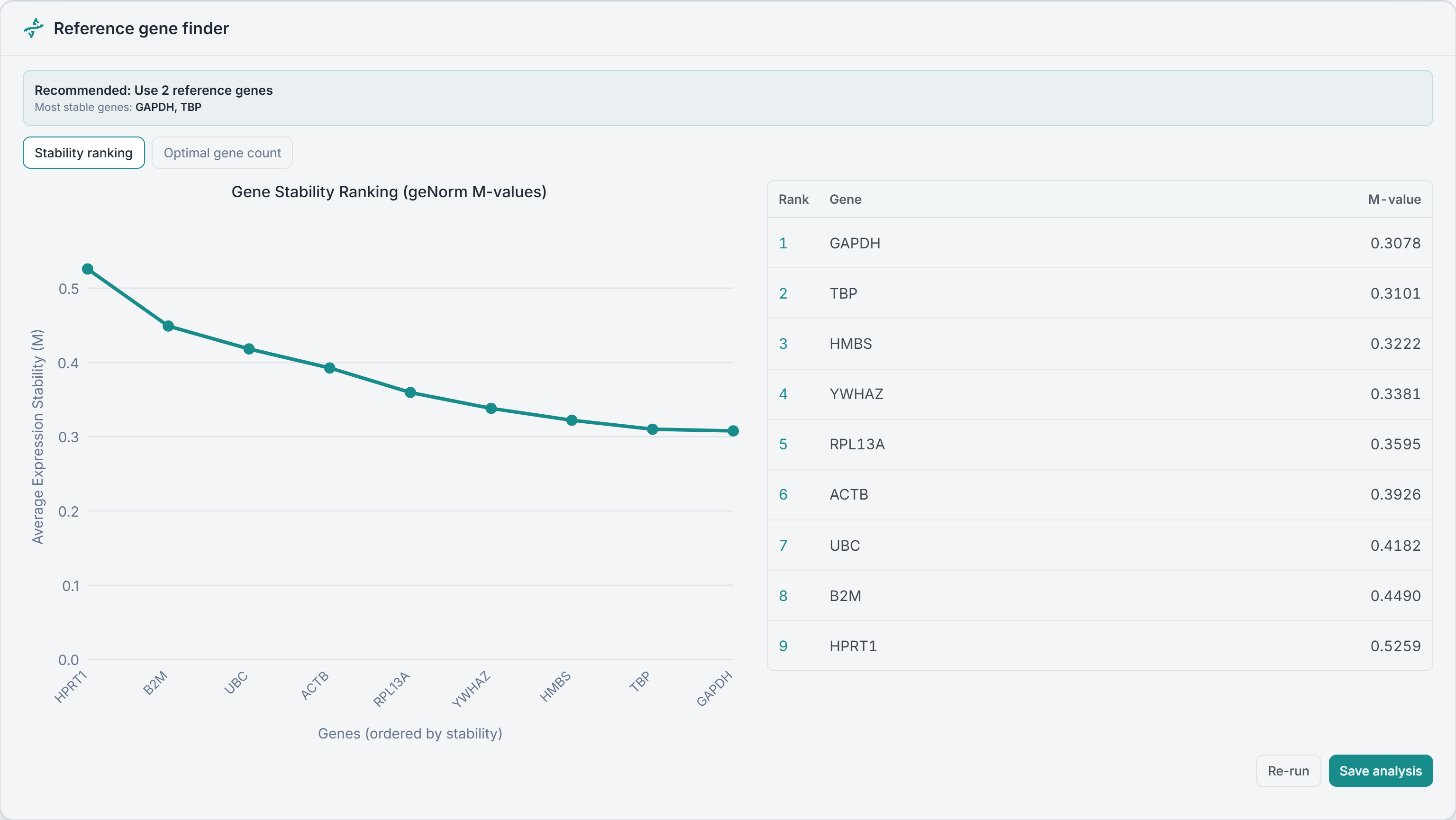
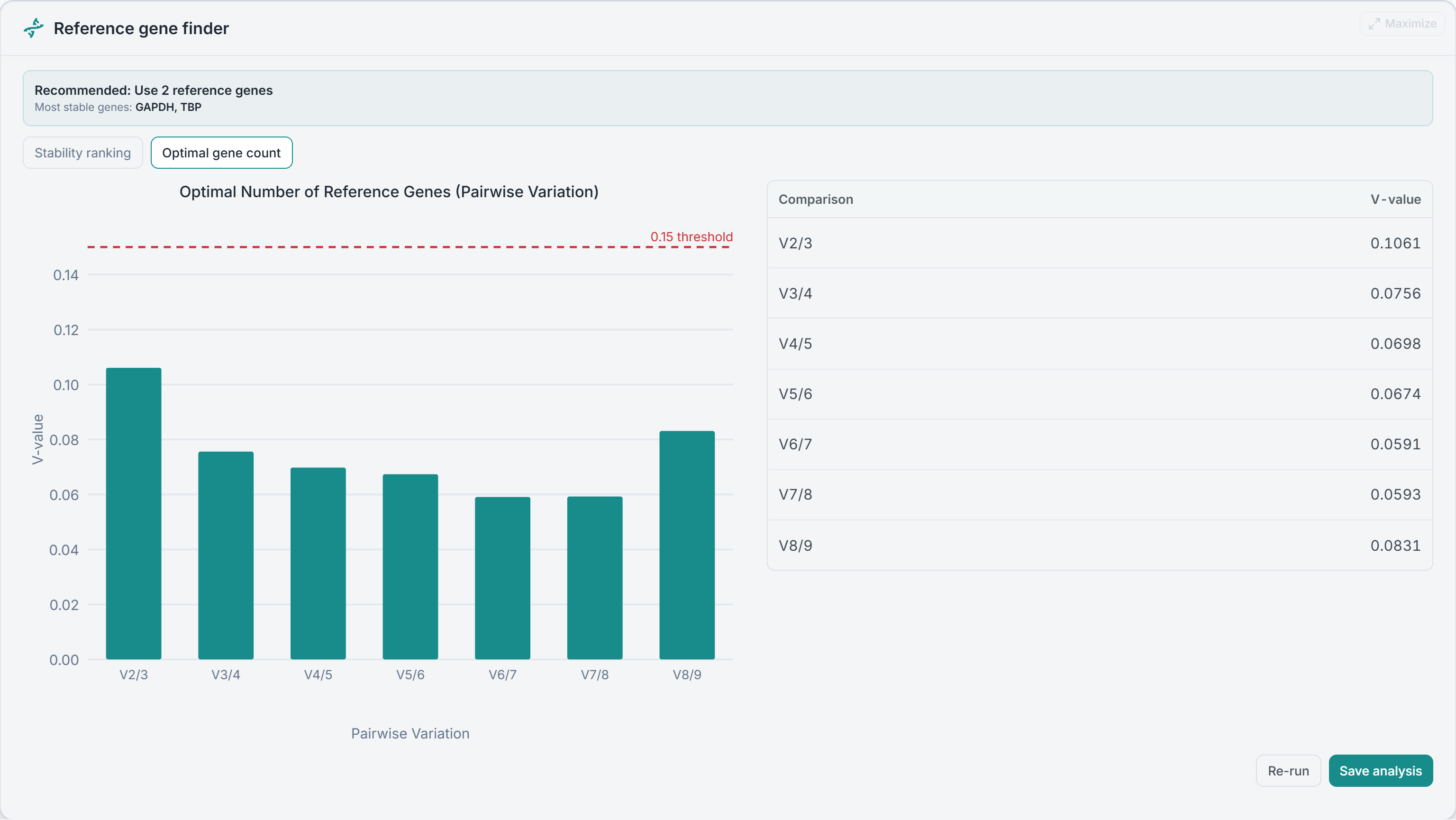
Normalize against one unvalidated reference gene and you can be off by up to 6.4-fold — that is what the geNorm paper found in 10% of cases (Vandesompele et al., 2002). So don’t guess. geNorm scores every candidate’s expression stability as an M-value (lower is more stable), ranks them, and reports the pairwise-variation V-value that tells you how many genes you actually need.
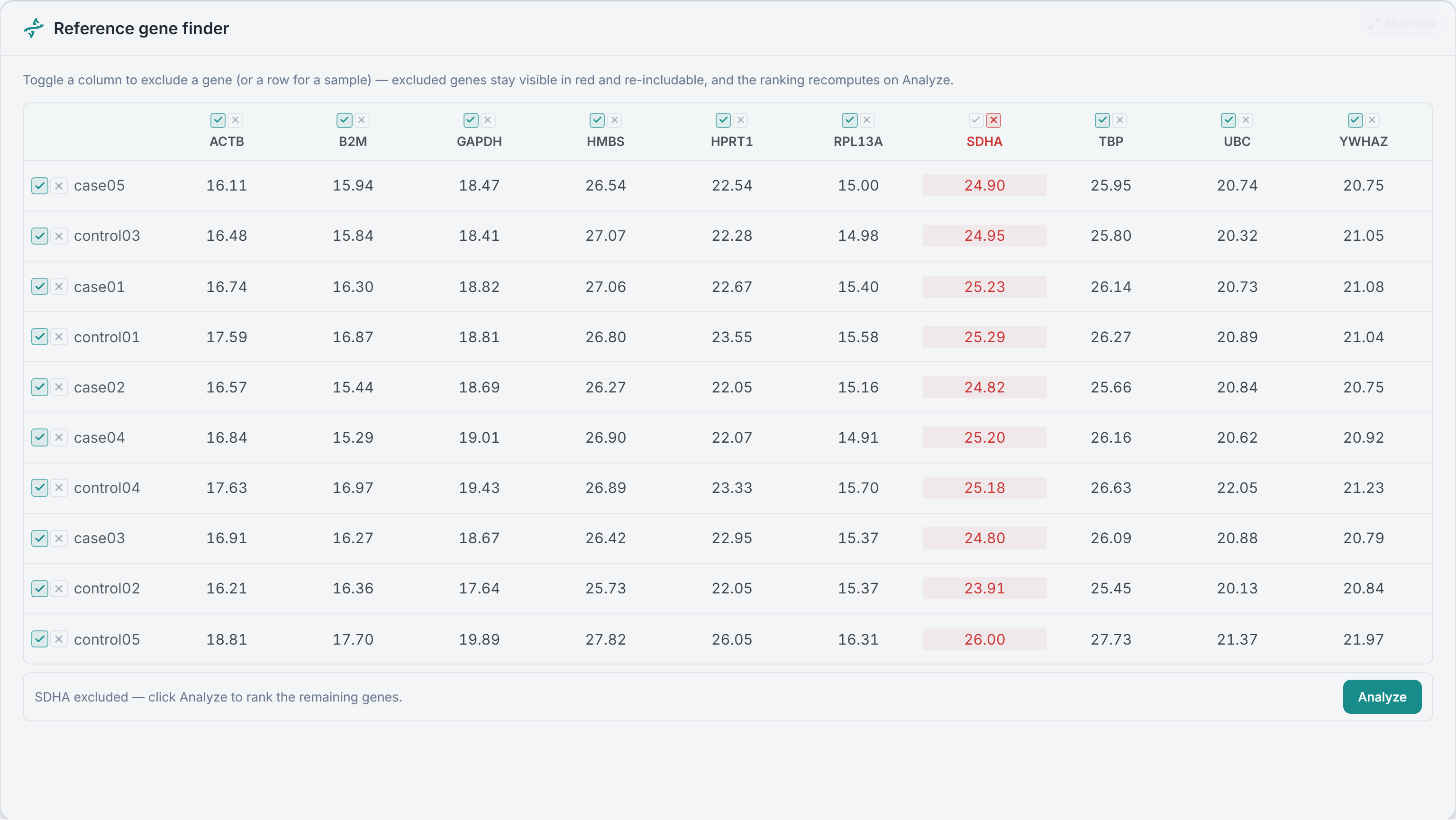
Suspect a gene is off? Toggle it out right in the grid and the ranking recomputes live — the excluded one stays visible in red, re-includable, nothing deleted from your data. It is the same geNorm the field has cited 23,000 times, run to a clear recommendation — the kind of reference-gene justification MIQE lists as essential for publication. Save it, and the ranking reopens exactly as you ran it.
qPCR data analysis, answered
What a defensible qPCR analysis actually requires — reference-gene validation, normalization, efficiency correction, quality control, and statistics — each answered with the equation and the paper behind it. geNorm, the qBase framework, and the MIQE guidelines were authored by Clarida’s founders; the math here is that same peer-reviewed methodology, carried forward.
Reference genes & normalization
Fold change & relative quantification
Amplification efficiency
Quality control, replicates & controls
Statistics & reporting
From Cq values to a result you can defend.
Paste your Cq values — geNorm, QC, and stats built in. Free to start.